
How to Customize Bootstrap
Custom themes for Bootstrap 4 with CSS or SASS
There various reasons to customize Bootstrap. You may want to:
- Change the existing Bootstrap styles such as colors, fonts, or borders
- Change the Bootstrap grid layout such as breakpoints or gutter widths
- Extend Bootstrap classes with new custom classes (ie: btn-custom)
Whatever the reason is, there are 2 ways to customize Bootstrap. I will start with the easier, less robust method using CSS, and then explain the more advanced method using SASS.
1. Simple CSS Overrides
This method works by defining CSS rules that match Bootstrap’s CSS rules which creates a style “override”. This method is easy to maintain, and allows you to upgrade to future minor versions of Bootstrap without breaking your customized styles.
In CSS, order matters. The last definition of a CSS rule will override any previously defined rules where the CSS selectors & properties match. This is how the CSS override customization method works.
Our CSS customizations are placed in a separate custom.css file, so that the bootstrap.css remains unmodified. The reference to the custom.css follows after the bootstrap.css which make the overrides work...
<link rel="stylesheet" type="text/css" href="bootstrap.min.css"> <link rel="stylesheet" type="text/css" href="custom.css">
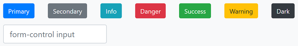
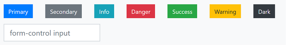
We add whatever changes are needed in the custom.css file. For example, say I wanted to remove rounded borders from Cards, Buttons and Form Inputs.

I add a CSS rule in the custom.css…
/* remove rounding from cards, buttons and inputs */
.card, .btn, .form-control { border-radius: 0; }
With this simple CSS change, the Cards, Buttons and Form Inputs now have square corners…

Here’s the working demo on Codeply:
CSS Specificity is Important.
When making customizations, you need to understand CSS Specificity.
Overrides in thecustom.css need to use selectors that are as specific as the bootstrap.css. For example, here’s the CSS for Bootstrap 4 nav-link shown on a dark background Navbar (.navbar-dark .navbar-nav):
.navbar-dark .navbar-nav .nav-link {
  color: rgba(255, 255, 255, 0.5);
}
To override the nav-link color, this won’t work ❌:
.navbar-dark .nav-link {
  color: silver;
}
My selector in custom.css should match the Bootstrap selector ✅:
.navbar-dark .navbar-nav .nav-link {
  color: silver;
}
Of course, using a more specific selector (higher specificity) will also work. Say for example you only wanted to change the nav-link colors is a Navbar with id=”#navbar1”…✅:
#navbar1 .navbar-nav .nav-link {
  color: silver;
}Note: There’s no need to use `!important` in the custom CSS, unless you’re overriding one of the Bootstrap Utility classes. CSS Specificity always works for one CSS class to override another.
By putting all the Bootstrap overrides in a separatecustom.css it’s much easier to keep track of changes and revert back to default the Bootstrap styles if necessary. If you make changes directly to the default bootstrap.css stylesheet, it would become very difficult to maintain and keep track of changes.
Any minor upgrades to Bootstrap versions can be done by simply swapping out the bootstrap.css, without breaking your customized styles in custom.css.
Using CSS overrides is feasible for simple Bootstrap customizations, but for more extensive changes, SASS is the better method. Suppose for example you want to change the default blue “primary” color in Bootstrap to another color (eg. red). You can make a simple CSS override for the .btn-primary button like this...
.btn-primary { background-color: red; }Yes, this works to make the .btn-primary button red. However, it doesn't change the other btn-primary states like ":hover", ":active" and “disabled”. It also doesn't change the "primary" color throughout the entire CSS for .alert-primary, .text-primary, .bg-primary, .btn-outline-primary, .badge-primary, etc...
For more extensive Bootstrap customizations like this, you’ll want to use SASS.
2. Customize Bootstrap using SASS
First let’s talk about SASS, and how it relates to Bootstrap:
- SASS is a stylesheet language and CSS pre-processor.
- SASS must be compiled into CSS to be “understood” by a Web browser.
- Files written in SASS usually have the
.scssextension. - The entire Bootstrap 4 CSS source is written in the SASS.
Since the entire Bootstrap 4 CSS source is written in the SASS language, the Bootstrap 4 CSS files are compiled using a SASS compiler (A.K.A pre-processor). Therefore, it only makes sense that SASS is the recommended way to customize Bootstrap.
1. Project Structure
First, let’s consider the Bootstrap 4 SASS files & folder structure…
|-- \bootstrap
| |-- \scss
| | |-- \mixins
| | |-- \utilities
| | |-- _functions.scss
| | |-- _mixins.scss
| | |-- _variables.scss
| | |-- (...more bootstrap scss source files)
| | |-- bootstrap-grid.scss
| | |-- bootstrap-reboot.scss
| | |-- bootstrap.scss
What you need know about the Bootstrap SASS source files
- The
bootstrap.scssfile is the “main” file that references all other SCSS source files using SASS@import ".."statements. - The
_variables.scssfile contains all the SASS variables that are available to customize and override. - The
_variables.scsscontains variables that are dependent on the_functions.scssand_mixins.scssfiles. - The Bootstrap CSS can be compiled with or without the Grid (
bootstrap-grid.scss) and Reboot (bootstrap-reboot.scss).
Commonly used Bootstrap SASS variables and maps
To know Bootstrap, is to know that there are a ton of SASS variables. Here are the more common ones that are helpful to know about…
Theme Colors
When it comes to customizing the default Bootstrap look, changing the color palette 🎨 is often the first thing that comes to mind. To change these colors use the $theme-colors SASS map…
$theme-colors: (
  "primary":    ..,
  "secondary":  ..,
  "success":    ..,
  "info":       ..,
  "warning":    ..,
  "danger":     ..,
  "light":      ..,
  "dark":       ..
);
Enable-…
These self-explanatory true/false variables can be toggled as desired…
$enable-rounded: true;
$enable-shadows: true;
$enable-gradients: false;
$enable-grid-classes: true;
$enable-print-styles: true;
Grid Breakpoints
The default responsive breakpoints are based on typical device widths, and can be changed as needed. Changing the $grid-breakpoints SASS map will change the breakpoint for the grid, as well as any other responsive classes (e.g. text-md-center, navbar-expand-lg)…
$grid-breakpoints: (
  xs: 0,
  sm: 576px,
  md: 768px,
  lg: 992px,
  xl: 1200px
);
Vertical and Horizontal Spacing
The “spacer” is used as the basis for padding and margins in many areas of the Bootstrap CSS. Increasing it slightly (eg. 1.1rem) will add more whitespace between some elements.
$spacer: 1rem;
As explained in the Bootstrap docs, your customizations should be kept in a separate custom.scss file that lives outside the Bootstrap SASS source files. Be sure the keep the _variables.scss nearby for reference when creating your custom.scss.
|-- \bootstrap
| |-- \scss
| | |-- \mixins
| | |-- \utilities
| | |-- (...more bootstrap .scss source files)
| custom.scss <-- changes go here outside bootstrap's SASS source
Similar to our CSS overrides explained earlier, using a separate custom.scss file allows us to make changes that don’t impact the Bootstrap source, which makes future changes and upgrades much easier without overwriting changes in the custom.scss.
2. Customize!
As stated earlier, there are different aspects of Bootstrap you might want to change or override with your own styles. I will show you an example of each.
Change an existing style such as colors, fonts, or borders…
Let’s revisit the change (customization) we made earlier to btn-primary. Instead of only changing the btn-primary, we want to change the primary theme color across the entire CSS. Here’s how this would be done in the custom.scss...
custom.scss
/* import only the necessary Bootstrap files */
@import "bootstrap/scss/functions";
@import "bootstrap/scss/variables";
/* -------begin customization-------- */
/* change the primary theme color to red */
$theme-colors: (
  primary: red;
);
/* -------end customization-------- */
/* finally, import Bootstrap to set the changes! */
@import "bootstrap";
Notice: The Bootstrap@importpaths are relative to thecustom.scss, and will vary depending on your project environment.
As you can see in the custom.scss we @import the Bootstrap files that are needed for the overrides. (Usually, this is just _variables.scss. In some cases, with more complex customizations, you will need the functions and mixins). Make the changes, then @import “bootstrap”. It’s important to make the changes before the @import "bootstrap”. Here’s another example:
Add a new theme color (btn-purple, bg-purple, text-purple, etc..)…
custom.scss
/* import only the necessary Bootstrap files */
@import "bootstrap/scss/functions";
@import "bootstrap/scss/variables";
/* -------begin customization-------- */
/* change the primary theme color, and add a new theme color */
$theme-colors: (
  primary: red;
  purple: $purple; // $purple is defined in _variables.scss
);
/* -------end customization-------- */
/* finally, import Bootstrap to set the changes! */
@import "bootstrap";
Change the grid layout breakpoints…
custom.scss
/* import only the necessary Bootstrap files */
@import "bootstrap/scss/functions";
@import "bootstrap/scss/variables";
/* --- begin customization ---- */
/* change the primary theme color to red */
$theme-colors: (
  primary: red;
);
/* increase the width of the grid lg and xl breakpoints */
$grid-breakpoints: (
  lg: 1024px,
  xl: 1366px
);
/* increase container width for the wider lg and xl breakpoints */
$container-max-widths: (
  lg: 1050px,
  xl: 1400px
);
/* --- end customization ------ */
/* finally, import Bootstrap to set the changes! */
@import "bootstrap";
Extend Bootstrap classes with new custom classes (ie: row-dark)…
You can extend existing Bootstrap classes to create new custom classes. For example, here is a new .row-dark class that extends (inherits from) the Bootstrap .row class, and then adds a background-color and color. Notice how these customizations are placed after the @import bootstrap.css.
custom.scss
/* 1. import only the necessary Bootstrap files */
@import "bootstrap/scss/functions";
@import "bootstrap/scss/variables";
/* 2. begin customization ---- */
(variable changes as before here...)
/* --- end customization ------ */
/* 3. import Bootstrap to set the changes! */
@import "bootstrap";
/* 4. add @mixin or @extend customizations here */
/* create new custom classes from existing classes */
.row-dark {
    @extend .row;
    background-color: #333333;
    color: #ffffff;
}
/* use @mixins */
.btn-custom {
@include button-variant(red, white, red, red);
}
Once the custom.scss contains the appropriate customizations, you’ll need to compile the SASS to generate the resulting CSS.
3. Compile the SASS
There are several tools that can be used to compile the SASS into CSS. All of the tools run on a Web server because, as stated before, Web browsers don’t “understand” SASS. Here are the most popular SASS building tools:
SASS Customization Summary…
1- First, our custom values are set in custom.scss, will override any of the variables that had !default values set in Bootstrap _variables.scss.
2- Then, Bootstrap is imported (@import "bootstrap") which enables the SASS compiler to generate all the appropriate CSS using both the Bootstrap defaults, and the custom overrides.
3- Finally, Any additional custom classes that @extend Bootstrap classes can be defined after the @import "bootstrap". These are added in the generated CSS after the customized Bootstrap classes from step 2.
If you prefer not to work directly with the SASS source there are tools available that make the SASS customization process easier. Themestr.app is a Bootstrap theme builder that provides a simple Web-based UI to make the changes and generates the custom.scss and custom.css for download.
Now you’re ready to go! 🚀I know that customization is important since not everyone wants that overly recognizable Bootstrap look. Using the methods (CSS or SASS) described it’s fairly easy to transform your Bootstrap 4 sites with a unique look…

Watch a video: How to create a custom Bootstrap 4 theme
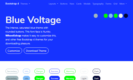
Free, open-source themes
Thank you for reading the entire story. I invite you to explore these themes 😲 created using the SASS customization method described earlier. You can download the modified CSS or SASS files for each theme at 🎩 Tophat, or create your own themes and customize with Themestr.app — a free theme builder & customizer for Bootstrap 4.
.png)